


SCOFrance
PartnersWaltr, AtmoSud, CNES
🎥 EDISON Presentation at the June 2026 Quarterly Meeting
KeywordsAtmosphere, emissions, GHGs, pollutants, air quality, climate action plans


EDISON: with GEMS, visualize GHG emissions at source and adapt your climate policies
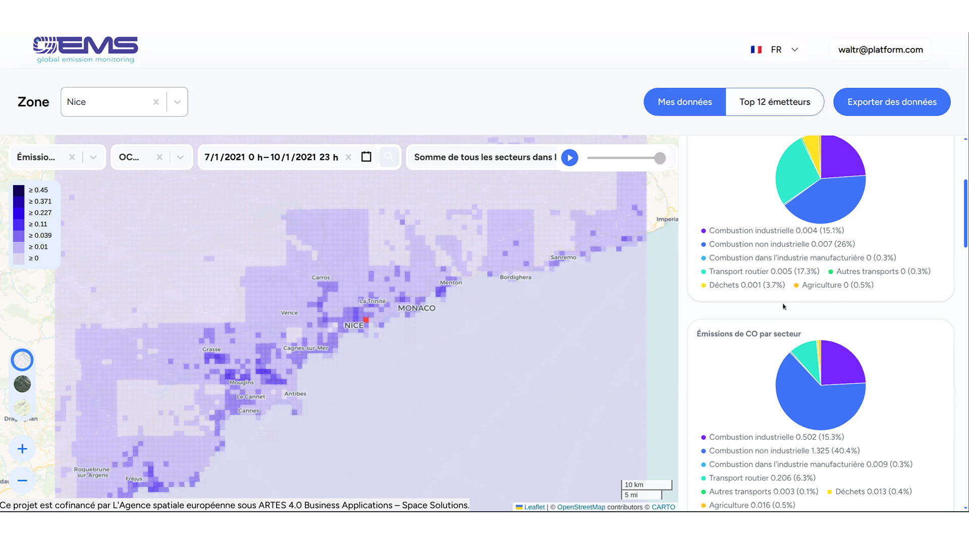
Subject to regulatory obligations, notably the PCAETs in France, local authorities are steering their climate and air quality policies with a limited perspective: emissions inventories published with a delay of several years; ground-based sensors that are often costly and concentrated in urban areas; and, ultimately, data that primarily describes the consequences – pollutant concentrations – without always making it possible to trace them back to the causes – the emission sources. But how can we take effective action when we do not know precisely where, when and why emissions are occurring? The SCO EDISON project addresses this highly practical question with its GEMS (Global Emission Monitoring) platform, developed and marketed by Waltr.
Seeing emissions where they originate
In line with its original ambition, EDISON has succeeded in producing an improved, dynamic and operational inventory of greenhouse gas and air pollutant emissions, which can be used directly by local authorities. To achieve this, the project combines several data sources: satellite observations (Sentinel-5P and Sentinel-3), existing regional inventories, the CHIMERE chemistry-transport model, and activity and socio-economic data (road traffic, population, economic sectors).
Today, following 24 months of work supported by SCO, EDISON is paving the way for action with operational data on NOx, CO₂, CO and PM2.5, presented in the form of maps via a digital portal. This portal enables users to identify hotspots, track emissions by sector of activity on a day-to-day and even hour-by-hour basis and compare cities with one another. Beyond diagnosis, EDISON generates predictions for NO₂ and PM₂.₅, enabling the modelling of scenarios – such as a vehicle fleet transitioning to electric – and the estimation of their impact on emissions.
For local authorities, the stakes are high: thanks to EDISON, they have a decision-support tool that is in step with ‘political timelines’, capable of monitoring the impact of development projects and regulations without having to wait several years. | The GEMS service is aimed at towns and EPCIs (groupings of several local authorities), a key level as it acts as an intermediary between the sub-local level – which has no remit to monitor air quality – and the regional level, which can carry out actions locally. [Read our news article of 19 June 2024, ‘Air quality is a question of scale’] |
Results: four regions providing revealing insights
Nice (France), Abidjan (Ivory Coast), Berlin (Germany) and Kavala (Greece) served as test sites. These territories were deliberately chosen for their contrasts – in terms of size, economic profile, climate and regulatory framework – in order to test the robustness and transferability of the approach. The project team studied NOx and CO2 emissions in order to:
| 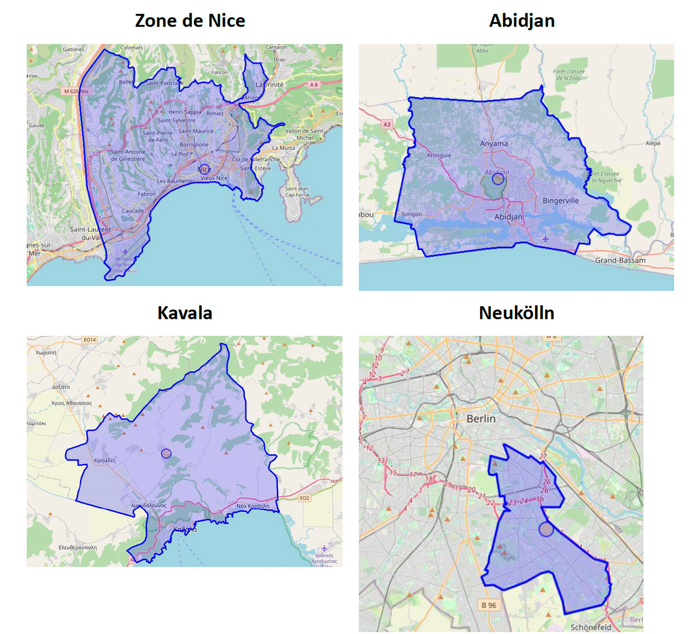 |
Here are the results for each site, followed by a comparative analysis.
🇫🇷 Nice: stable NOₓ levels, slight rise in CO₂
A Mediterranean city with a population of 340,000, Nice combines heavy road traffic and seasonal tourist activity, with an international airport but a limited industrial base.
👉 EDISON data show NOₓ emissions to remain relatively stable between 2020 and 2025, at around 43 tones per day, in contrast to CO₂ emissions, which are set to rise by approximately 1.3 kt/day. 👉 Seasonal variation remains moderate, with – as shown in the figure on the right – a double peak: in winter (due to energy demand) and, increasingly since 2022, in summer, likely as a result of the rise in air-conditioning use and tourist flows during the summer months. A comparison with the city’s electricity consumption confirms a correlation between energy use and the observed emissions. | 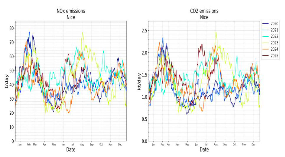 ▲ Time series for NOx on the left and CO2 on the right. © Waltr |
🇨🇮 Abidjan: rapid urban growth and a sharp rise in emissions
With rapid urban development, Abidjan is home to more than 5 million people and is a major regional hotspot.
👉 Average NO₂ maps show that the city itself is a significant source of emissions, fueled by growing road traffic, peri-urban industrialization and intense port activity.
👉 Time series data reveal a rapid increase in emissions: approximately +20 t/day/year for NOₓ and +40 t/day/year for CO₂. This trend is consistent with the documented increase in port traffic and overall transport volumes.
👉 The observed seasonality – higher emissions at the start of the year and lower in summer – cannot be explained by heating, which is absent in a tropical climate. It likely reflects a combined effect of tropical meteorology, the rainy season, atmospheric washout and variations in dispersion. This case illustrates the complexity of interpreting ‘apparent emissions’, which are inextricably linked to local atmospheric conditions.
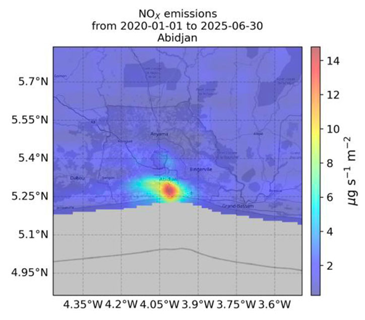 | 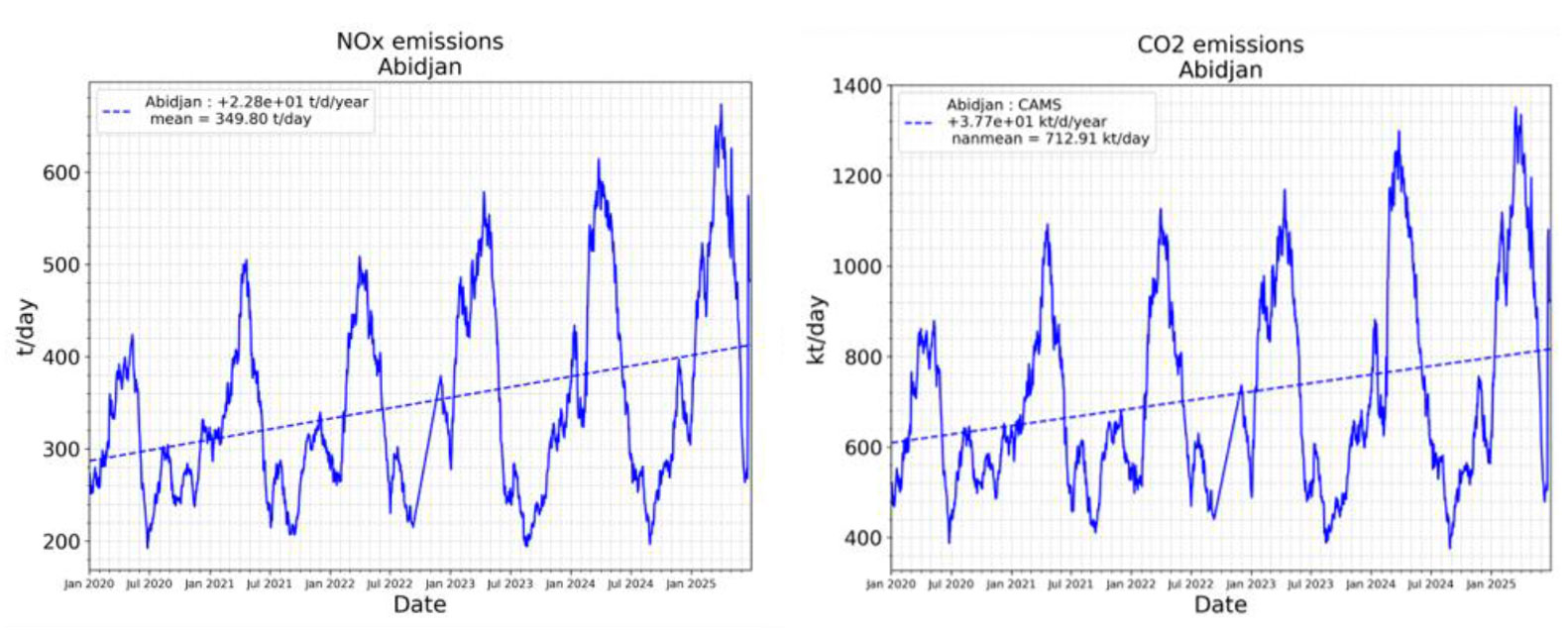 |
▲ From left to right: map of NOxemissions over Abidjan from 2020 to 2025, time series for NOx and CO2. © WaltR | |
🇩🇪 Neukölln: the transition at neighborhood level
In Berlin, the Neukölln discrtict offers a change of scale.
👉 The maps clearly show that the centre of Berlin is where the main emission hotspots are concentrated. Neukölln alone accounts for 6 per cent of the city’s total emissions. ► Comparison of daily NOx emissions for the city of Berlin as a whole (orange) and for the Neukölln district alone (blue). © Waltr | 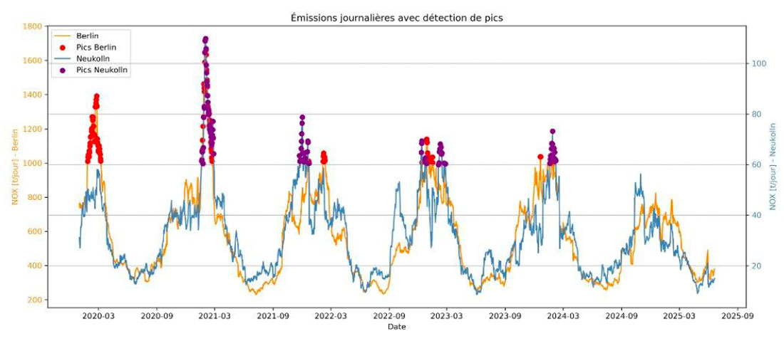 |
👉 NOₓ emissions show a marked winter seasonality, typical of northern European cities, linked to gas-fired domestic heating and a ‘canyon-like’ urban morphology that limits dispersion. The average stands at 31.5 tones per day, but the trend is downwards, with a reduction of approximately –2 t/day since 2020.
👉 CO₂ follows the same trend (–2 kt/day), consistent with that of Berlin as a whole, confirming that energy transition and mobility policies are beginning to have a measurable impact.
🇬🇷 Kavala: the disproportionate impact of an industrial hub
Kavala provides a striking counter-example. A small Greek port town with a population of around 70,000, it nevertheless has higher emissions than Nice and Berlin.
👉 The emissions maps identify three main emission zones: the town itself, the airport, and an industrial area to the west. Enclosed by cliffs, this latter area is subject to a ‘basin effect’ whereby pollutants are trapped. ► Map of NOx emissions in Kavala from 2020 to 2025, showing the three main sources. © Waltr 👉 NOₓ emissions show a typical winter pattern, with a slight decrease (~–1 t/day). | 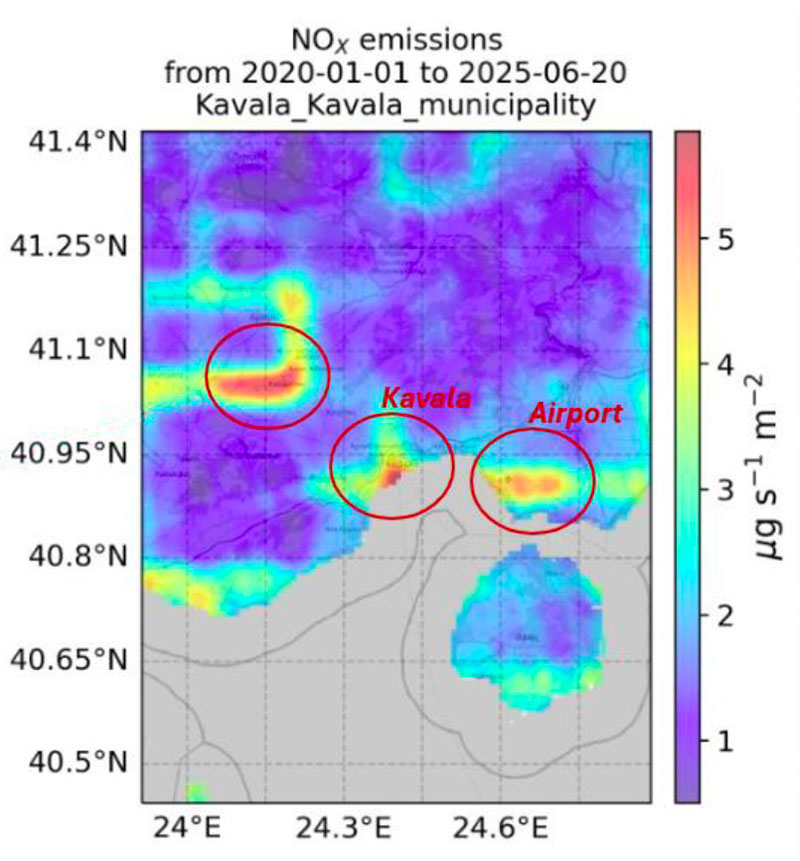 |
👉 CO₂ follows the opposite trend: after remaining relatively stable until 2023, emissions rise, reaching an average of 27.5 kt/day, with an annual increase of approximately 5.9 kt/day over five years. The increase in port traffic partly explains this trend but is not the sole factor: emissions remain high in winter, when port activity is lower, highlighting the combined role of heating and regional industry (refining, energy). ► Time series of CO₂ in Kavala from 2019 to 2025. © Waltr | 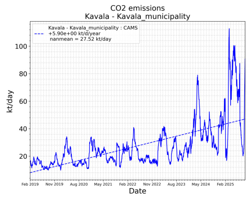 |
EDISON’s measurements and maps reveal common trends, notably marked seasonality, but also significant differences. In Europe, emissions are tending to stabilize, or even decrease locally, as a result of climate policies. In Abidjan, they are rising rapidly, reflecting accelerated urbanization. Kavala, despite its small size, illustrates the disproportionate impact of a localized industrial hub, with per capita emissions far exceeding those of the European cities studied.
► The ranking of annual NOₓ emissions is telling: Abidjan leads by a wide margin (~100,000 t/year), followed by Kavala, then Nice and Neukölln. This ranking does not reflect population size, but rather the energy and industrial profiles of the regions. © Waltr | 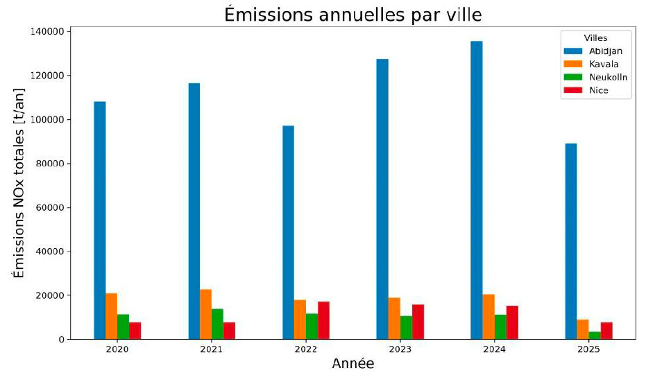 |
👉 These starkly contrasting results demonstrate that urban emissions are largely determined by local energy choices and economic structures. They also confirm the value of a satellite-based approach, which allows for a consistent comparison of vastly different national contexts.
Outlook
With other cities already showing interest, such as Angers in France and Düsseldorf in Germany, Waltr is already working on several improvements, particularly in terms of scenario modelling and forecasting, as well as distinguishing between locally generated pollution and pollution experienced (originating from neighboring areas). Several topics are also under discussion with Thales Alenia Space, for example, to integrate Sentinel-4 data. | Excellent user feedback As a pilot user, the city of Nice was impressed by the up-to-date emissions data and the intra-annual trends revealed, which it had not previously had access to. The city has just installed 70 sensors to create its own monitoring network, which will be integrated into the future EDISON dashboard with new features such as inter-annual trends. |